Monday, July 27, 2009

Artist Portfolio Discussion

I'm going to discuss the portfolio of Jenniffer Peffer "Neon Dragon" located at NeonDragon.com
First of all I want to say that the site itself looks beautiful including her artwork and showing her talent at design. The background is nicely textured but neutral colored so it gives interest but doesn't distract from her artwork. Navigating around the website is very easy because of the many links on the top bar. Another way she makes finding what you're looking for easier is that she has sorted all of her art in many ways. All of her art is shown in the gallery using thumbnails so you can see if you want to check the picture for more detail or not. Also when you click on a thumbnail it goes to a new page with the picture,a description and nothing else distracting (yet it retains the background and the image is centered so it looks good) Wherever you go on this site the links on the top always stay and clicking on the logo will return you to the home page. Her site does have a fantasy theme because that's what she mostly draws, however she keeps the decorations under control so they're not annoying or distracting.

Saturday, July 18, 2009

Sculpture Research Henry Moore


These are two unnamed (I think) sculptures by Henry Moore. I was initially drawn in by the organic feel of the rounded flowing forms. I like the choices of material he used. On the one is the very reflective white which gives interesting lighting and on the other one is a lovely texture and color. I've also noticed that there is great use of negative space in these sculptures because of how the form folds onto itself creating the holes

Sculpture Research Tony Smith


Left: Willy
Right: Generation

These are two sculptures by Tony Smith. These strike me more as minimalist sculptures with their simple geometric layouts yet as obviously seen in "Generation" they are on a large scale. I found the "large minimalism" very humorous.

Sculpture Research David Smith


Left: Hudson River Landscape
Right: The Forest

These are two sculptures by David Smith. What I like about these are that you can see hints of every day objects in them however he has warped and melded them so that you have to look closer to recognize them. Another reason I chose this artist was that I found the movement of the curved wires very appealing. One thing that I thought was odd yet unique was that most of his sculptures seem mostly two dimensional.

Sculpture Research Tatlin


Left: Installation
Right: Monument to 3rd International

These are two sculptures by Vladimir Tatlin. What instantly drew me in to these sculptures was the strong motion given off by the spirals, gentle curves, and waves. Both sculptures reminded me of a roller coaster. Monument has a strong upward movement but is slightly skew, seen from a different angle though there is a very distinct diagonal running through it which look very appealing. This sculpture is very unique because it actually has moving geometric parts on the inside and also was supposed to be larger than the eiffel tower.

Friday, July 10, 2009

Video Project Proposal

For my video I will be going through an internal struggle that happens quite often. I will be working on something such as homework then the "internal me" will place a distraction near me such as a game or phone etc. I will have the option of picking it up or not but I do. This happens a few times throughout the video. I keep looking at the clock feeling guilty but keep listening to the "inner me" and get distracted. Then I take a breath and close my eyes. When I open them the "inner me" is gone. Finally one last distraction is placed in front of me but I can ignore it.
The footage will mostly be in doors but I was thinking about one of the distractions going outside for variation. I will most likely be the only one in the video but if I can find volunteers I could possibly write them in.
I want the audience to think about a persons willpower especially against themself. I also wanted to put some distractions in there that weren't completely bad so that the audience thinks about priorities. Often times it's easy to procrastinate on something important with other things that are still important and good.
I don't think there would be too much audio in this. Probably some sound effects coming from the distractions. I do want some music in there too that starts off calm and gets more nervous as I keep running out of time. There will be some first person shots and also some mid shots. I don't think I'll need too many master shots though. I do want to start it off with an extreme closeup on my pencil tapping the paper or something to show what I'm doing then slowly zoom out so the viewer continually gets more information about me and my surroundings. I will have some shots where I'll look on the table and nothing will be there but when I look back the distraction will have appeared. Then it will pan up revealing me as my inner self so you know I put it there.

Tuesday, July 7, 2009

Video Art Quiz

1) Name an Early artist mentioned in the article for CONCEPTUAL WORK performing in front of the camera.  Describe a work.  (2 points)
John Baldessari was an artist that performed conceptual work in front of the camera in his work "I am making art". In that film he stands appearing disheveled with a brick wall behind him making very slow continuous movements while he repeats the words of the title endlessly.  This is conceptual because it tests the boundaries of the definition of art as it applies to video.
2) Name an artist mentioned who deals with PERSONAL NARRATIVE. Describe a work.  (2 points)
Bruce Neuman created a personal narrative in his work Wall/Floor Positions where he uses his body as a moving sculpture in the space of his studio. 
3) Describe the piece you were most interested in viewing after reading this article. Look the work  up on the links, and expand on Rush's comments. (2 points)
I decided to look up the work 3 Transitions by Peter Campus. The reason I decided to look at these was he was trying out some special effects the camera offered such as layering 2 films over each other or deleting portions of the screen. Campus was using these clips as a metaphor for the inner and external person. In the first part his inner self is coming out of his external self and in the 2nd one he erases his outer self so the inner self can be seen. I just think this video shows a lot of creativity using a fairly new medium.
4) What do you better understand now about Video Art? (2 points)
I have learned that video art doesn't have to have a plot or even sometimes a meaning. To my surprise video art was a way for artists to play around with the camera and experiment with the new creative possibilities it offers.
5) Based on Rush and this article, what makes Video Art vs. an "artful video"? (2 points)
Rush describes that the most defining feature about Video Art which separates it from artful video is the what the video was made for.  Artful video is always created to promote or inform etc. whereas video art "creates a moment of personal expression regardless of practical application"

Tuesday, June 30, 2009


Some pictures for the project at half size because blogger doesn't allow over 8MB. Also I don't know how to put the words above the pictures.

Monday, June 29, 2009

Research Artist #3 - Kyle Butler


This picture is a digital self portrait by Kyle Butler. It seems as though the space in this picture is used efficiently. The images shown on the screen follow an implied curve along the bottom of the screen allowing room for the artists face to show through almost unblocked. The artists hands and face also follow a curve from the middle of the image to the bottom right. The exposure on the original photo fits nicely with the idea that he's in front of a computer screen because the hand touching the screen is very bright and the artist's face is also lit up by the screen.

Identity is addressed in this image through showing a self-portrait of the artist performing an activity. Instead of a stationary self-portrait, the artist is interacting with the computer and you can see his reaction to what is happening on the screen. Many parts of the artists identity can be gathered by what's displayed on the screen. There are photos of various friends or possibly family, and Batman the Dark Knight is playing.

The aspect I like most about this image is the concept behind flipping the desktop backwards so it appears that the viewer is inside the computer looking out at the artist. I think the black border around the main part of the image helps this concept of being inside the computer. Finally, I enjoyed how the artist was able to include many more insights into his identity through what he put on the screen.

Research Artist #2 - Chuck Close


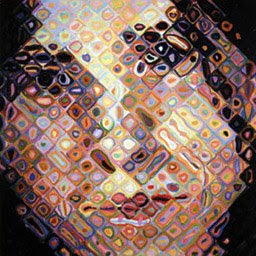
This piece of artwork is (I believe) traditional paints and created by Chuck Close. First off this piece has a strong sense of rhythm because of the repetition of squares. It's not too repetetive though because the squares somewhat blend with the other surrounding squares. There is very little actual line in this image. Like in realism much line is replaced with gentle gradients. This picture seems to have a good balance of light and dark. The colors in the individual squares are very vibrant yet so small that when seen from a distance the eye blends them into the skin tones. It seems to me that the eye on the right is a little too high.

This image deals with identity most apparently because the subject of the image is the artists self-portrait. I believe that the style they chose to represent themself shows some of their identity also. The squares remind me of pixels on a computer each filled with their own individual data. This could mean that the artist is strongly connected with technology. I'm also noticing that in the portrait the artist has a blank expression and I wonder if there's a significance to that.

The reason I was interested in this picture was the interesting variation on what could have been just an every day portrait. I have always liked pictures that have two very different looks when viewed from various distances. I also find it interesting that even though the squares remind me of pixels, the artist turned all the squares diagonal to make them seem less pixel-like.

Research Artist #1 - Negar Nahidian


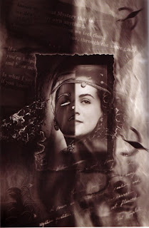
This is a Digital Imaging and Collage piece of artwork by Negar Nahidian. The colors in the image are all on a grayscale value of one hue which gives the image a uniform and almost old-fashioned look. The focus of the piece is the double self-portrait which is centered and framed with a black border. There is an implied diagonal that runs from the bottom left to the top right behind the center photos which adds some variety to the very uniform picture. There is also some text that fades in and out of the top and bottom portions of the picture creating another diagonal which aids in the composition. There are also many other flowing elements in the image to contrast the formal parts such as the texture on the right and the semi-transparent black lines at the bottom.

This paragraph addresses identity through a double self portrait. The two halfs seem to be opposites of eachother alluding to the possibility that the artist felt like she ran two seperate lives. Maybe on the surface she appeared nice but in her mind she had a darker side.

This piece appealed to me because of the overall feel the color scheme gives. Also dualities such as the light and dark in this image intrigue me. The two drastically different portraits make me wonder at what might have been going on in the artists life so I enjoy that this image generates more images in my imagination.

Digital Arts assignment 1


The reason I'm studying to be an artist is because I have always enjoyed drawing. I don't think that I would be satisfied with any other career because I'd always wonder what would happen if I became an artist. The parts of digital art I'm interested in are animation and 2-d modeling. I also want to try out some of the skills needed for video game design to see if I like it. By the time I graduate I hope to have a competitive skill in techniques and a clear idea of the type of digital art I want to pursue.